Themes and appearance
Home Assistant can look like a control room or a clean, quiet dashboard. Configure light and dark modes, install a community theme, customize theme YAML and individual views, and keep text readable on every display.
Why this matters
After the first 12 chapters, your devices have names, your areas are organized by floor, your dashboards have views, and your automations run on their own. Yet the interface may still look exactly as it did on day one.
Appearance has a direct effect on usability. If the interface is unpleasant or hard to read, people stop opening it and return to physical switches. When it suits your home's lighting, remains readable on your devices, and feels comfortable at night, everyone is more likely to keep using it.
This chapter addresses three specific problems:
- Glare at night: A bright white interface can feel like a flash in a dark room. Automatic dark mode solves that problem.
- Different preferences: One person may prefer a dark, high-contrast display, while another finds it difficult to read. Each user can choose a separate theme.
- An unfinished-looking wall display: The default colors and “Home Assistant” browser title can make a permanently mounted tablet look more like a test system than a finished control panel.
Community-theme steps require HACS; install it as described in Appendix A. See Chapter 6 for dashboard editing.
What exactly is a theme?
A Home Assistant theme does not redraw the interface. It supplies a set of visual values, primarily through CSS variables.
Imagine a row of labels on a wall:
- “Primary color = sky blue”
- “Card background = white”
- “Primary text = dark gray”
Interface components read these shared values instead of choosing their own colors. Change a value, and buttons, cards, and sidebars throughout the interface update together. That is why a theme file containing only a few dozen lines can transform the whole system.
This mechanism also limits what a theme can do:
First, distinguish between three concepts that are often confused:
| Term | What it controls | Where to configure it |
|---|---|---|
| Theme | Colors, some spacing, and corner radius | Select it in Profile; store theme files in the configuration directory |
| Light/dark mode | Light and dark variants of one theme | Profile; can follow the operating system automatically |
| Dashboard layout | Which cards appear and how they are arranged | Dashboard edit mode (Chapter 6) |
Changing a theme does not change your cards, and editing cards does not change the theme. The two are independent.
Where to find theme settings
Home Assistant 2026.2 changed both the location and behavior of this setting.
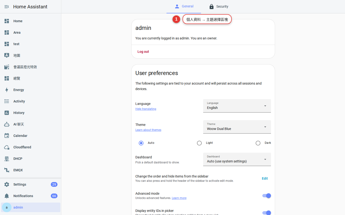
Current location: Profile. Select your name at the bottom of the sidebar. On the General tab, find the Theme selector under User preferences; Home Assistant describes it as “What does Home Assistant look like?”
The Home Assistant 2026.2 release notes state: "The theme has been moved! You can now find and switch your favorite appearance directly in your user profile, so that you can apply the same theme on any device you log in to."
The theme section in Profile usually contains two settings:
-
Choose a theme
The menu always includes “Default,” along with any community themes you install later. A new system has only the default theme; this is expected.
-
Choose light and dark mode
If a theme provides both light and dark modes, you can choose either one or let Home Assistant follow your phone or computer. When the operating system switches to dark mode, Home Assistant follows it. Select a fixed mode only if you do not want automatic switching.
The option's name and position vary by version—some releases show “Auto,” while others provide Light and Dark buttons. Follow the labels shown in your version and look for the option that follows the system setting.
The same release also moved Developer Tools from the sidebar into Settings. In 2026.8, “Developer tools” was shortened to “Tools.” This chapter therefore uses the current path, Settings → Tools. On an older release, use Developer Tools in the sidebar; the available functions are the same.
Choose a monitoring or control-oriented style
Choose a design goal before installing themes. Most shared dashboards favor either dense monitoring or simple controls.
| Characteristic | Route A: Technical control room | Route B: Minimal and spacious |
|---|---|---|
| Background | Near-black or dark blue-gray; pure black can reduce power use on OLED screens | Off-white or light gray, similar to paper |
| Primary color | Highly saturated turquoise, electric blue, or orange | Muted wood tones, blue-gray, or dark green |
| Cards | Visible borders, modest corner radius, and dividers | No borders, generous corner radius, and sections defined by white space |
| Information density | High: a page filled with values, charts, and status indicators | Low: only a few controls that people regularly use |
| Best suited to | A wall-mounted tablet in a home office, a secondary monitor, or an equipment room | An entryway, living room tablet, or family members' phones |
| Main risk | Dark-gray text disappears on pure black, while neon text strains the eyes on small screens | Low-contrast light-gray text on white can disappear in bright sunlight |
A useful rule is: monitoring screens can be information-dense; control screens should be simple. A personal energy view may contain many charts, while a shared entryway tablet should present only a few large, clear controls.
These approaches can coexist. The section on assigning a theme to an individual view explains how.
Built-in themes vs. HACS community themes
Home Assistant includes the Default theme with light and dark modes. Version 2026.2 redesigned it, replacing the old blue top bar with styling aligned with Settings. A visual change after upgrading is therefore expected.
If you want more choices, there are three ways:
| Approach | YAML required? | Advantages | Disadvantages | Best for |
|---|---|---|---|---|
| Use only the built-in Default theme | No | Most reliable across upgrades | Only one visual design | People who simply want a dependable system |
| Install a community theme with HACS | Yes, three configuration lines | Many ready-made color schemes and managed updates | The maintainer may stop, or frontend changes may break parts of it | Users who want more styles without designing one |
| Write your own theme YAML | Yes, written by hand | 100% control with no external theme dependency | You must research variable names and maintain the theme yourself | People with a specific color scheme in mind |
When choosing a community theme, apply the same criteria used for integrations in Chapter 11. Start with the date of the latest update. A theme untouched for two years may still use variables that Home Assistant has removed, leaving parts of the interface unstyled.
Install your first community theme
The process has five steps. Do not skip steps 2 and 3; otherwise HACS may report success while the theme remains absent from Profile.
-
Download a theme in HACS
Open HACS, search for the theme you want, open its page, and select Download. The HACS documentation states that themes downloaded through HACS are stored in the
themes/directory inside your Home Assistant configuration directory—commonly referred to as/config/themes/.The HACS category is named “Theme.” If it does not appear in your installation, theme support may not yet be enabled; complete the next step first.
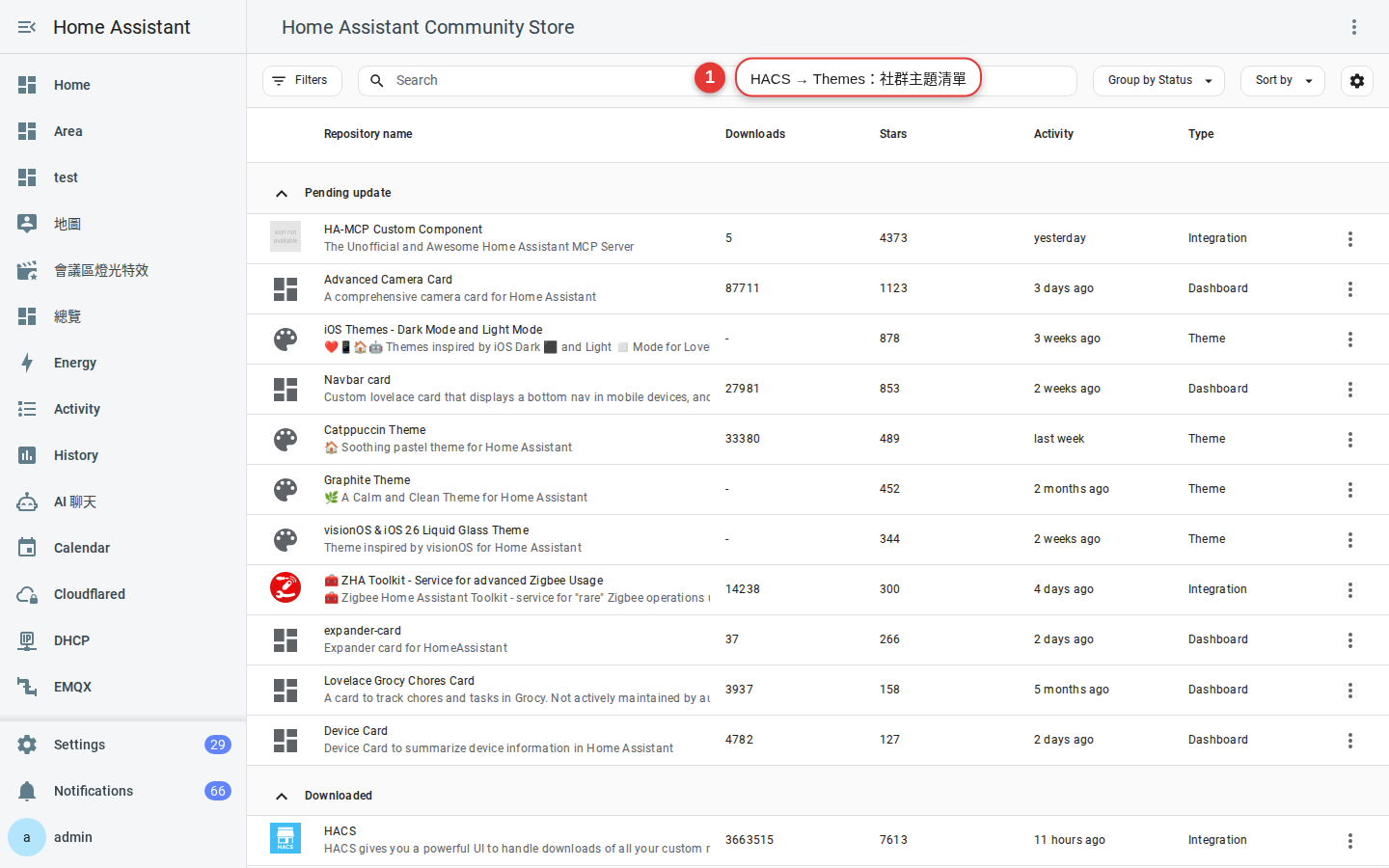
Figure 13-2 HACS → Themes. Community themes can be sorted by downloads, stars, and update date. -
Add three lines to configuration.yaml
Use an add-on such as File editor or Studio Code Server to open
configuration.yamlin the configuration directory. Add this at the top level:frontend: themes: !include_dir_merge_named themesThese lines merge files from
themes/into the theme mapping.!include_dir_merge_namedis a Home Assistant YAML extension. The frontend documentation also allows another directory, such as!include_dir_merge_named my_themes, but HACS usesthemes.If
configuration.yamlalready containsfrontend:, do not add another one. Addthemes:under the existing key. YAML does not allow duplicate keys at the same level. -
Validate the configuration
Go to Settings → Tools → YAML, select Check configuration. Correct every reported error before proceeding; indentation and extra colons are common causes.
Danger: A YAML syntax error can prevent Home Assistant from starting. Always check the configuration before restarting. If startup fails, correct the file through available host access or restore a known-good backup as described in Chapter 9. -
Reload themes
After adding the
frontend:block for the first time, restart Home Assistant. Later theme edits or installations do not require a restart. Open Settings → Tools → Actions and runfrontend.reload_themes. It takes no parameters; in YAML mode, enter this single line:action: frontend.reload_themesThis action reloads the theme settings from configuration.yaml without restarting Home Assistant. If the selected theme no longer exists after the reload, Home Assistant returns to the standard theme. Only administrators can run this action.
Settings → Tools → YAML can also reload configuration. Quick reload reloads all supported configuration, while this tab may provide controls for reloading individual items. If Themes is not listed, run the action above.
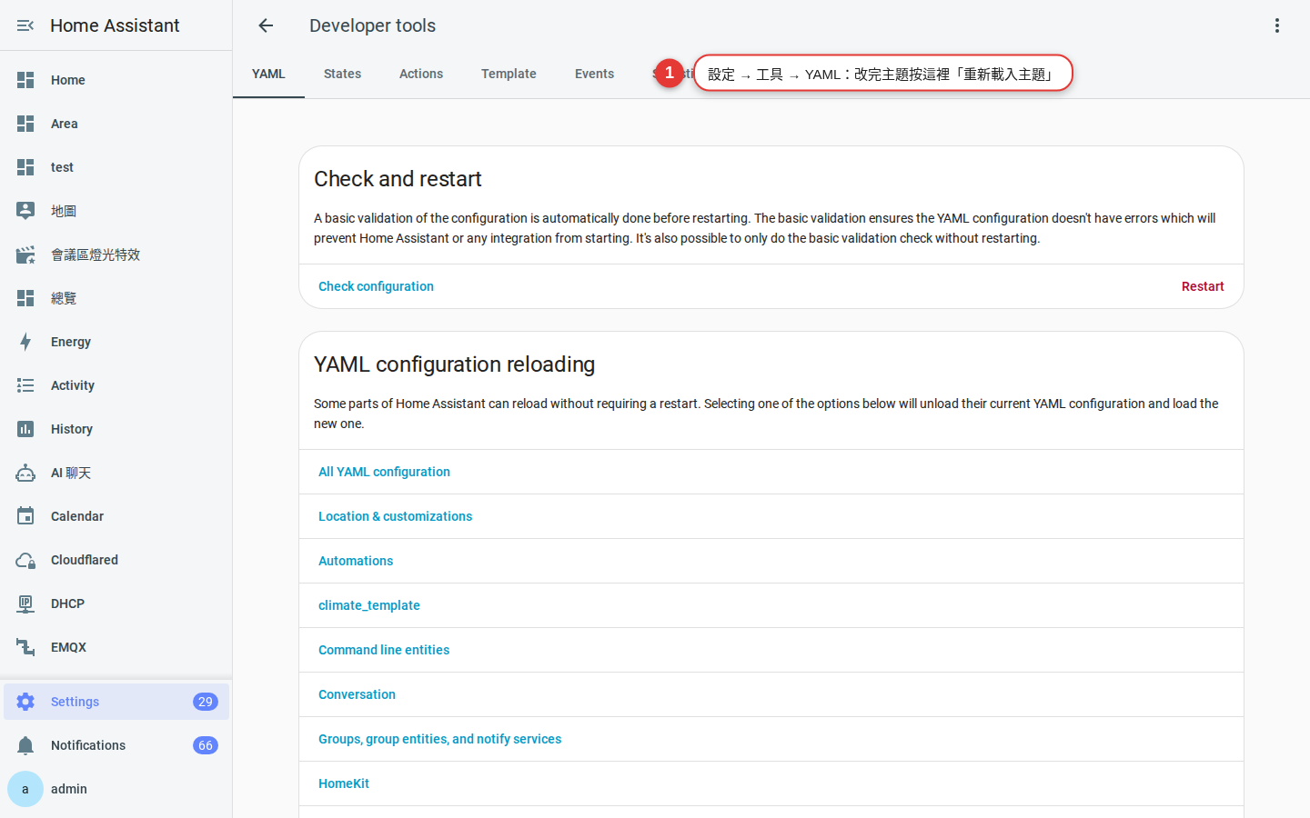
Figure 13-3 Settings → Tools → YAML. After editing a theme, reload it here instead of restarting Home Assistant. -
Apply the theme in Profile
Select your name at the bottom of the sidebar, then find the theme selector on the General tab. The newly installed theme should now appear in the menu. Select it, and the interface should change immediately without a refresh or another login.
If it does not change, try a hard refresh first (Ctrl + Shift + R). The browser cache is the most common cause.
configuration.yaml can prevent startup, and a backup takes only three minutes.Create a theme: YAML structure and variables
Once you understand the structure of a theme file, you can fine-tune an existing theme or create one from scratch. The minimum example in the Home Assistant frontend documentation looks like this:
frontend:
  themes:
    happy:
      primary-color: pink
      accent-color: orange
    sad:
      primary-color: steelblue
      accent-color: darkred
If you use the !include_dir_merge_named themes approach shown above, create a new file in /config/themes/, such as my_home.yaml. Do not repeat frontend: or themes: inside that file; start directly with the theme name:
my_home:
  primary-color: "#2f8f6b"
  accent-color: "#e0a458"
  primary-text-color: "#1c1c1c"
  card-background-color: "#ffffff"
  primary-background-color: "#f4f2ed"
Colors can use a named value such as pink, hexadecimal such as "#2f8f6b", or rgb(47,143,107). Quote values that begin with #; otherwise YAML treats the remainder as a comment.
Light and dark modes
A practical theme provides both modes. In Home Assistant, add a modes: block:
day_and_night:
  primary-color: coral
  modes:
    light:
      secondary-text-color: olive
    dark:
      secondary-text-color: slategray
The order in which Home Assistant applies these values is worth remembering because it explains why a change may appear to have no effect:
-
Start with the default theme
Home Assistant first loads all variables from the default theme. Variables that you do not define therefore retain their default values rather than becoming transparent or black.
-
Apply mode-independent values
Next, Home Assistant applies variables defined at the theme's top level, outside
modes:. In the example above,primary-color: coralapplies in both light and dark mode. -
Apply mode-specific values last
Values under
modes: light:ormodes: dark:have the highest priority. If a variable appears at both the top level and under a mode, the mode-specific value wins.
The documentation describes two additional behaviors: a legacy theme with no modes: block uses the default light theme as its base; if a theme defines only a dark mode, Home Assistant selects that mode automatically.
Common theme variables
In theme YAML, write the variable name without two leading hyphens. In card-mod or CSS, reference it as var(--primary-color). The most useful variables are listed below:
| Variable | Controls | Where the change is most visible |
|---|---|---|
primary-color |
Primary color | Active switches, links, and primary buttons |
accent-color |
Accent color | Floating buttons and some sliders |
primary-text-color |
Primary text | Card titles and entity names |
secondary-text-color |
Secondary text | Muted text such as “10 minutes ago” |
disabled-text-color |
Disabled text | Unavailable or disabled controls |
card-background-color |
Card background color | The background of each card |
primary-background-color |
Page background | The area behind cards |
secondary-background-color |
Secondary background | Section and tab backgrounds |
divider-color |
Dividers | Lines between list items |
sidebar-background-color |
Sidebar background | The sidebar |
sidebar-text-color |
Sidebar text | Menu item text |
sidebar-icon-color |
Sidebar icon | Unselected menu icons |
sidebar-selected-icon-color |
Selected sidebar icon | The icon for the current page |
state-icon-color |
Inactive entity icon | The muted icon for a light that is off |
state-active-color |
Active entity icon | The highlighted icon for a light that is on |
state-inactive-color |
Inactive entity color | The inactive counterpart to the active color |
ha-card-border-radius |
Card corner radius | For example, 4px or 20px
|
ha-card-border-width |
Card border thickness | Set it to 0 for no border |
ha-card-border-color |
Card border color | Prominent borders in a control-room design |
error-color |
Error color | Warnings and error messages |
Why the color of an active light is more complicated than it seems
Entity icon colors often cause confusion because no single variable always takes precedence. The Home Assistant frontend documentation defines the following lookup order: the more specific the variable, the higher its priority. Home Assistant uses the first matching variable and ignores the rest.
| Priority | Variable pattern | Meaning |
|---|---|---|
| 1 (highest priority) | state-{domain}-{device_class}-{state}-color |
A specific state for a device class, such as a curtain-type cover being open |
| 2 | state-{domain}-{state}-color |
A domain state, such as lights being on: state-light-on-color
|
| 3 | state-{domain}-active-color |
Any active entity in a domain, such as state-light-active-color
|
| 4 (fallback) |
state-active-color / state-inactive-color
|
Common presets for all entities |
To use warm orange for active lights and blue for active climate entities, set state-light-active-color and state-climate-active-color. To change the fallback for every active entity, set state-active-color.
state-icon-active-color to change the color of an entity that is on. This variable has not been used since Home Assistant 2022.12. The Home Assistant developer blog lists it, along with paper-item-icon-active-color, as obsolete. If icon colors in a copied theme do not change, check for these variables and replace them with the level 3 or 4 patterns in the table above.Apply themes to views and system defaults
Assign a theme to a single view
This is how a dense control-room view and a spacious family view can coexist. Each dashboard view can specify its own theme. The Home Assistant view documentation defines theme as an optional string that applies a theme to the view and its cards.
Enter dashboard edit mode, select the pencil icon for the view you want to change, find the Theme field, and choose a theme. To configure it directly in YAML, use the documented format:
- title: Home
  theme: happy
For example, keep the main family dashboard simple and spacious, then create a dark, information-dense “System” view for CPU, network, battery, and Zigbee signal data. Each view retains its own appearance.
Use an automation to change the system-wide default theme
You can change the system-wide default themes with an action—for example, to provide everyone with a light theme during the day and a dark theme at night. The action is frontend.set_theme; the Home Assistant documentation gives this example:
action: frontend.set_theme
data:
  name: "HA Light"
  name_dark: "HA Dark"
The name parameter sets the light-mode theme; use "default" to return to the standard theme. The name_dark parameter sets the dark-mode theme; use "none" to remove that override. You must provide at least one parameter. Home Assistant saves the setting across restarts, and only administrators can run the action.
Using the three-part automation structure from Chapter 8, you can switch themes at sunset like this:
alias: Switch to dark theme at sunset
triggers:
  - trigger: sun
    event: sunset
actions:
  - action: frontend.set_theme
    data:
name: "my_home_dark"card-mod: styling beyond themes
Themes can change only the variables that Home Assistant exposes. Tasks such as enlarging the title on one card, rotating one button's icon by 45 degrees, or making a card turn red above 28 degrees are beyond a theme's scope. For those changes, use card-mod.
card-mod is a frontend custom component available through HACS. It inserts CSS styles into dashboard cards. The project is actively maintained and provides a compatibility table. Installing an incompatible version is a common reason that correctly written styles have no effect. Check your Home Assistant version first:
| Home Assistant version | The card-mod version to install |
|---|---|
| 2026.2.0 or above | 4.2.0 (currently the latest) |
| 2025.11.0 and above | 4.1.0 |
| 2025.1.0 or above | 3.4.4 |
| 2023.10.0 and above | 3.2.3 |
HACS installs the latest release by default. If your Home Assistant installation is older, manually select the compatible card-mod version in the HACS download dialog.
To use card-mod, add a card_mod: block to the card's YAML configuration:
type: entity
entity: sensor.living_room_temperature
card_mod:
  style: |
    ha-card {
      color: red;
    }
ha-card is the card's outermost element, and the declaration inside braces is standard CSS. To use theme colors instead of hard-coded values, reference a variable:
card_mod:
  style: |
    ha-card {
      border: 1px solid var(--primary-color);
      border-radius: 18px;
}| Requirement | Should I use themes or card-mod? |
|---|---|
| Change colors across the site | Theme |
| Change all cards to rounded corners together | Theme (ha-card-border-radius) |
| Only this card is different | card-mod |
| Change color according to a sensor value | card-mod (with a template) |
| Hide a line of text on the card | card-mod |
Rebranding: change the “Home Assistant” name
For a wall-mounted tablet or a shared office display, you may want the browser title, icon, and home-screen name to use your household or organization's identity. Start with this important limitation:
The practical options are:
| Approach | What it can change | Status |
|---|---|---|
| Rename the shortcut when adding it to a phone or tablet home screen | Text below the home-screen icon | Safest option; uses an operating-system feature and does not modify Home Assistant |
| Browser Mod | Browser-level details such as tab icons, plus wall-tablet features such as pop-ups and full-screen mode | Actively maintained, with a release in May 2026 |
frontend: extra_module_url: to load a custom JavaScript module |
Potentially the title, favicon, and page text | The loading mechanism is supported, but you must write or obtain the module yourself |
| Community rebranding module | Title, favicon, logo, and login page | Several small projects exist; verify maintenance status before installing one |
| Old favicon custom component | — | No longer maintained; its author recommends Browser Mod instead. |
extra_module_url is documented by the Home Assistant frontend integration. Configure it like this:
frontend:
  extra_module_url:
    - /local/my_module.js
/local/ maps to the www/ directory inside the Home Assistant configuration directory. Home Assistant loads the module using import(). The loading mechanism is supported, but you are responsible for the code you load.
extra_module_url. It runs whenever you open Home Assistant while signed in and has access to your session. Review the source code before installing it, or use code from an established and trusted community author.The name of the progressive web app (PWA) added to a home screen comes from a manifest file supplied by the server, and Home Assistant does not expose a setting for it. The simplest solution is to edit the name when selecting Add to Home Screen on your phone. This changes only the shortcut and carries no Home Assistant upgrade risk.
Interface language, fonts, and non-Latin text
Switch interface language
There are two levels of language that many people confuse:
| Level | Where to configure it | Who it affects |
|---|---|---|
| User language | Profile page → General tab → Localization settings | Only you, across every device where you sign in |
| System language | Settings → System → Home Information, under "Region" | The entire system, including backend-generated text such as voice-assistant responses and notifications |
In addition to language, Profile localization settings control the time zone, number format, time format, date format, and first day of the week. These preferences are tied to your account and follow you to every device where you sign in. Family members can therefore choose different formats—for example, a 12-hour clock—without affecting one another. System-level locale settings, including the time zone, units, currency, country, and language, are covered in Chapter 2.
Community volunteers translate Home Assistant through Lokalise, and each release includes the latest available translations. Traditional Chinese has long been supported and appears by name in the language menu. Because translation is volunteer-led, new features may remain partly in English for their first few months. This is normal and translations usually arrive within the next one or two releases.
Practical issues with Chinese fonts and layout
Home Assistant does not bundle a Chinese font; it asks the browser to use a system font instead. The same dashboard can therefore look different across platforms:
- iPhone / iPad / Mac: Chinese text usually appears in PingFang and needs little adjustment.
- Android: A font from the Noto Sans CJK family is common and usually works well.
- Windows: Chinese text often falls back to Microsoft JhengHei, whose lighter weights can look blurred on dark backgrounds.
- Low-cost China-market tablets: These are the most likely to have limited font packages. A device may include only Simplified Chinese fonts, leaving some Traditional Chinese characters missing or displayed as boxes.
Three practical measures help:
-
Keep names concise
Chinese characters take up more horizontal space than Latin letters, so long entity names are easily truncated on phone cards. Four to six Chinese characters is the safest length. The naming principles in Chapter 4 directly affect the finished interface.
-
Font weight matters more than typeface
Thin text can look blurred on a dark background. For a dark theme, increasing text contrast is usually more effective than changing the typeface: changing the typeface requires a third-party module, while changing the color requires only one theme variable.
-
Test the wall display in place
Do not stop after adjusting the theme on a computer. Check the wall tablet from the distance at which people normally use it. Text and controls that look adequate at a desk may be too small in their actual setting.
Dark-mode contrast and accessibility
The most serious failure of a dark theme is not its appearance but its readability. The designer may see it clearly in a bright room on a high-end display, while an older family member cannot. Test it on different displays, in different lighting, at typical viewing distances, and with different users.
Follow these practical rules:
| Rule | What to do | Why it matters |
|---|---|---|
| Keep body-text contrast at 4.5:1 or higher | Use an online contrast checker to test foreground and background colors. | WCAG sets this as the minimum contrast ratio for most text; lower contrast is difficult for many people to read. |
| Use pure black with care |
#000000 with #ffffff can feel harsh during extended use; consider #121212 with #e8e8e8 instead.
|
Pure black can reduce power use on OLED displays, but extreme contrast may be less comfortable. |
| Don’t rely solely on color to convey status | Do not represent On and Off with color alone; use a distinct icon or text label as well. | Color-vision deficiencies are common enough—especially among men—that one or two people in a typical classroom may have trouble distinguishing red from green. |
| Don’t make secondary text too gray |
secondary-text-color is one of the easiest variables to make unreadable. |
It manages timestamps, units, and status descriptions, all of which are useful information. |
| Do not use accent colors for body text | Bright cyan or fluorescent green may work as a button border, but not for a full paragraph. | Thin, highly saturated text can produce color fringing on small displays. |
Also consider two physical conditions that cannot be solved by theme settings alone:
- Outdoor and entryway use: In bright sunlight, light themes can be easier to read than dark themes. If you regularly use Home Assistant outdoors, leave the mode on Auto rather than locking it to Dark.
- Night-time use: Darkness is only part of the requirement; low brightness matters too. The device's dark mode and automatic brightness handle much of this, provided the theme does not use large white card backgrounds.
Common problems
-
HACS reports that the theme is installed, but it is missing from the Profile menu
In about 90% of cases,
configuration.yamldoes not includefrontend: themes: !include_dir_merge_named themes, or Home Assistant has not been restarted since the setting was added. Adding thefrontend:block for the first time requires a full restart. After that,frontend.reload_themesis sufficient.In the remaining cases, the directory name or location does not match the configuration. Confirm that the configured
themespath matches thethemes/directory at the HACS location and directly contains at least one.yamlfile. -
The configuration check reports a YAML error
Check four items: indentation uses spaces rather than tabs; a space follows each mapping colon; colors beginning with
#are quoted; and only onefrontend:key exists at that level. A duplicate key can produce an error reported on another line. -
Selecting a theme has no effect, or the entire screen turns black
Start with a hard refresh (Ctrl + Shift + R), then try a private browsing window. If the problem remains, switch back to Default. If the interface returns to normal, the theme is incompatible with your Home Assistant version.
Frontend regressions can also prevent a theme from applying and are often corrected in a later minor release. If the problem began after an upgrade, read that release's notes and known issues before rewriting the theme.
-
I changed a variable, but part of the interface remains unchanged
There are three common explanations: the component does not use that variable (inspect it in the browser to identify the actual variable); a value at the theme's top level is overridden by the same variable inside
modes:; or the variable was renamed or removed in a newer release. The Home Assistant variable list is marked as a work in progress, so it is not exhaustive. -
I want a dark theme on my phone and a light theme on my computer
Since 2026.2, the selected theme is tied to the account and remains consistent across that account's devices. The Home Assistant project currently has no plan to restore per-device theme selection. The available workaround is to create a separate user account for the device.
-
My frontend.set_theme automation has no visible effect
A theme selected in Profile takes priority over the system default. Set the Profile theme back to Default so the automation can affect your account.
-
card-mod styles broke after an upgrade
First confirm that the card-mod version supports your Home Assistant version; the project page provides a compatibility table. Update it through HACS if necessary. If the versions match but the style is still broken, Home Assistant's internal component structure has probably changed and the selector must be updated. This maintenance burden is an inherent cost of card-mod.
-
I can't find Developer Tools
Version 2026.2 moved it from the sidebar into Settings, and version 2026.8 shortened its name to Tools. The current path is Settings → Tools. The YAML, States, Actions, and Templates tabs remain available there.
FAQ
Will changing the theme affect my automation or devices?
configuration.yaml, where a typo can prevent startup. Always run the configuration check first.Do I have to use HACS to change themes?
themes/ directory in the Home Assistant configuration directory and place your .yaml file there. In configuration.yaml, add frontend: themes: !include_dir_merge_named themes. HACS only simplifies discovery, downloads, and updates.Can each person in the family have a different theme?
How does Auto decide when to use dark mode?
frontend.set_theme.Can I replace the Home Assistant name and icon with my own?
What is the difference between theme and card-mod? Which one should I learn?
Do I have to restart Home Assistant after changing a theme file?
configuration.yaml with a new frontend: block. After that, when you edit a theme or install another one, go to Settings → Tools → Actions and run frontend.reload_themes; no restart is required. If the selected theme no longer exists after reloading, Home Assistant safely returns to the standard theme.